Hi, and welcome to a new DataCanvas visualization.
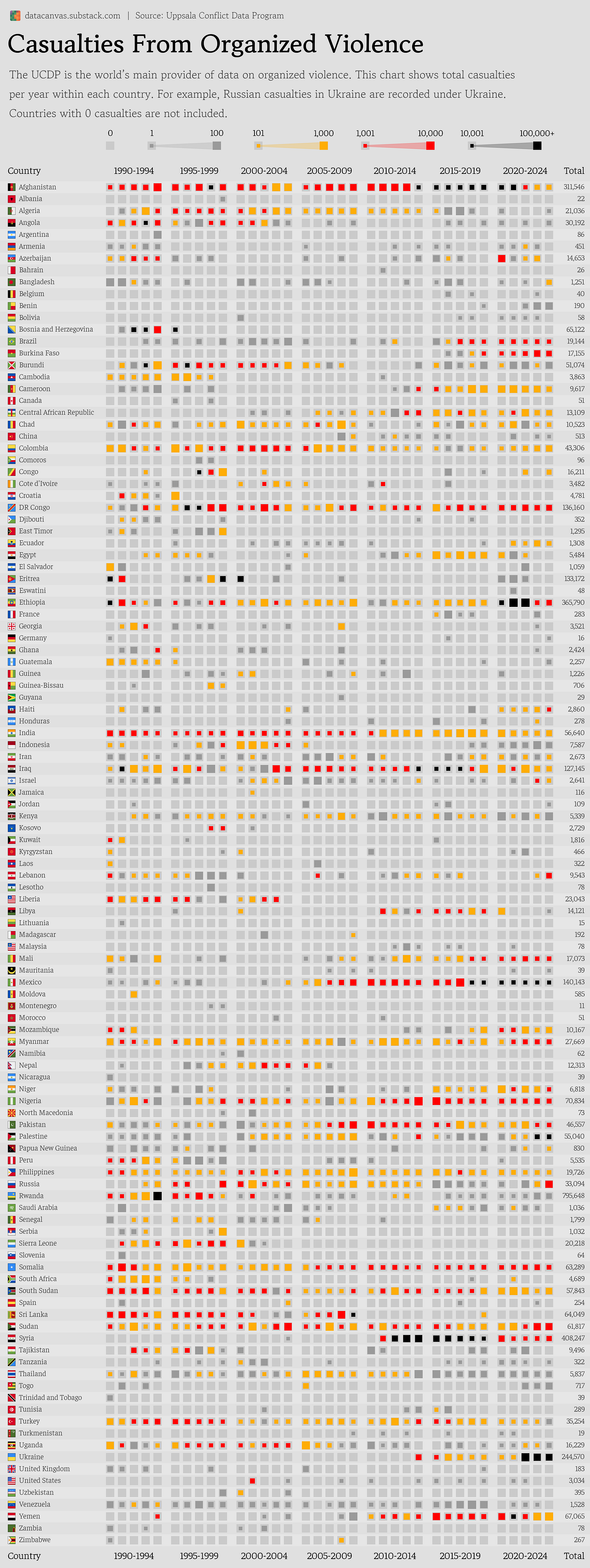
Today, I’ve prepared a mouthful of a chart where I do my best to display casualties from armed conflicts for all countries between 1990 and 2024.
I had an idea on how to make that work which I wanted to try out.
You are my guinea pigs, so let me know what you think about this data visualization and what you want to see more or less of going forwards.
About the data source
The Uppsala Conflict Data Program is the world’s main provider of data on casualties from armed conflicts.
An armed conflict means a clash between two organized groups, or between one organized group and civilians.
The conflict needs to cause at least 25 deaths in one year.
The UCDP use news reports, academic research, and other contemporary sources to estimate the number of deaths.
Note that casualties are recorded based on where they happened, not based on the nationality of the deceased.
This means for example that Russian soldiers killed in the war with Ukraine falls under Ukraine in the chart.
Data visualization
I’ve tried to fit as much data into the chart as possible.
I wanted to create a grid pattern using squares of different sized and colors to indicate the number of casualties.
Let me know what you think!
I hope you learned something new.
Parting words
I completely understand if you classify this as information overload.
Sometimes, I want to try to squeeze as much information as possible into a chart because it always leads to some interesting ideas.
Let me know what you think ni the comments, and don’t forget to like and share.
Thank you for your precious time!


Hi Oscar. Perhaps rank countries from top to bottom by casualties instead of alphabetical order?