


Qatar Has 2.5x as Many Males as Females
Visualizing how infrastructure spending skewed Qatar’s gender balance

Most countries have a somewhat even distribution of males and females. In fact, there tend to be slightly more females since they live a few years longer on average.
But there some parts of the world have a skewed gender distribution, and today, we will look at the strangest of them all, Qatar.
I’ve created three data visualization that should blow your mind! 🤯
A stacked area chart showing population over time divided by gender
A population pyramid in 1-year buckets for 2023
A population pyramid animation from 1950 to 2023
#1 How Qatar’s male-dominated population grew over time
First, we have a simple area chart showing how Qatar’s population growth accelerated around 2005, driven by major infrastructure investments. This boom brought a surge of construction workers—mostly men—from Asia and Africa. As a result, both the total population and the gender imbalance increased sharply.
Males already made up about 69% of Qatar’s population in 1990, as the country relied on male-dominated sectors like construction, oil, and gas that required foreign labor. The gender gap peaked in 2008, when males accounted for 76.2% of the population.
Since then, the share of males has declined to 71.5%, partly due to a slowdown in infrastructure development and a rising demand for female-dominated roles such as domestic work and cleaning services.

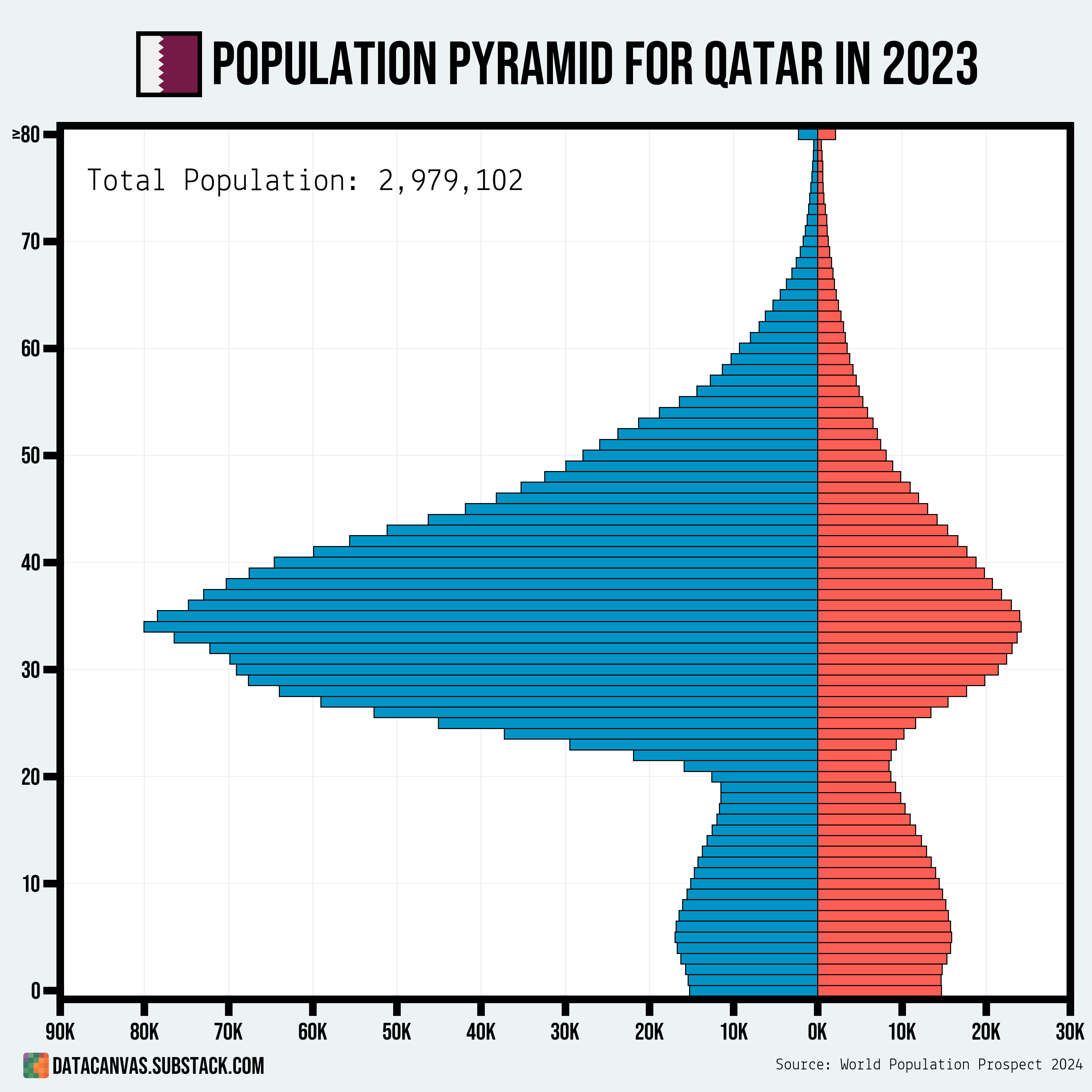
#2 Qatar’s current population pyramid
The unnatural gender distribution becomes even more striking when looking at Qatar’s population pyramid for 2023.
In most rapidly growing countries, population increases are driven by high birth rates, resulting in a demographic where children outnumber adults. But in Qatar—and several other Gulf nations—the growth is fueled mainly by immigration, which is far less common globally.
The chart below shows how males aged 30 to 40 make up a disproportionately large portion of the population.
#3 How Qatar’s population pyramid changed from 1950 to 2023
To really emphasize how rapidly Qatar’s population—especially the male population—grew after 2005, I created the following animation showing how the population pyramid changed from 1950 to 2023.
It’s clear that foreign male workers had been driving much of Qatar’s population growth even before 2005, but that’s when the real explosion in numbers began.

Other male-dominated populations
Qatar has the highest male-to-female ratio of any country, but it’s not the only one where population growth has been driven primarily by the immigration of construction workers.
Below is a list of the ten countries with the highest proportion of males.
Highest Male-to-Female Ratios:
Qatar — 71.5%
United Arab Emirates — 64.0%
Maldives — 62.1%
Oman — 62.1%
Bahrain — 62.1%
Kuwait — 61.2%
Saudi Arabia — 60.1%
Seychelles — 55.2%
Palau — 53.9%
Bhutan — 53.5%
You might also be curious which countries have the lowest male-to-female ratios. Here’s a reference list.
Lowest Male-to-Female Ratios:
Moldova — 46.0%
Latvia — 46.3%
Armenia — 46.4%
Russia — 46.4%
Ukraine — 46.5%
Georgia — 46.6%
Belarus — 46.6%
Lithuania — 47.2%
Tonga — 47.4%
Serbia — 47.5%
Thank you
Thank you for making it all the way to the end. If you have idea or feedback, let me know in the comments.
And as usual, I appreciate any feedback, like, share, or comment I get. Data Canvas is still a small newsletter and I need your help to understand how I can bring something unique to the table.
Awesome visualization
That population pyramid is striking. Am I correct in inferring that many of the guest workers seem to be staying long term?