
Population Change for US States
Ranking US states on population change between 2020 and 2023 using data from the US Census Bureau

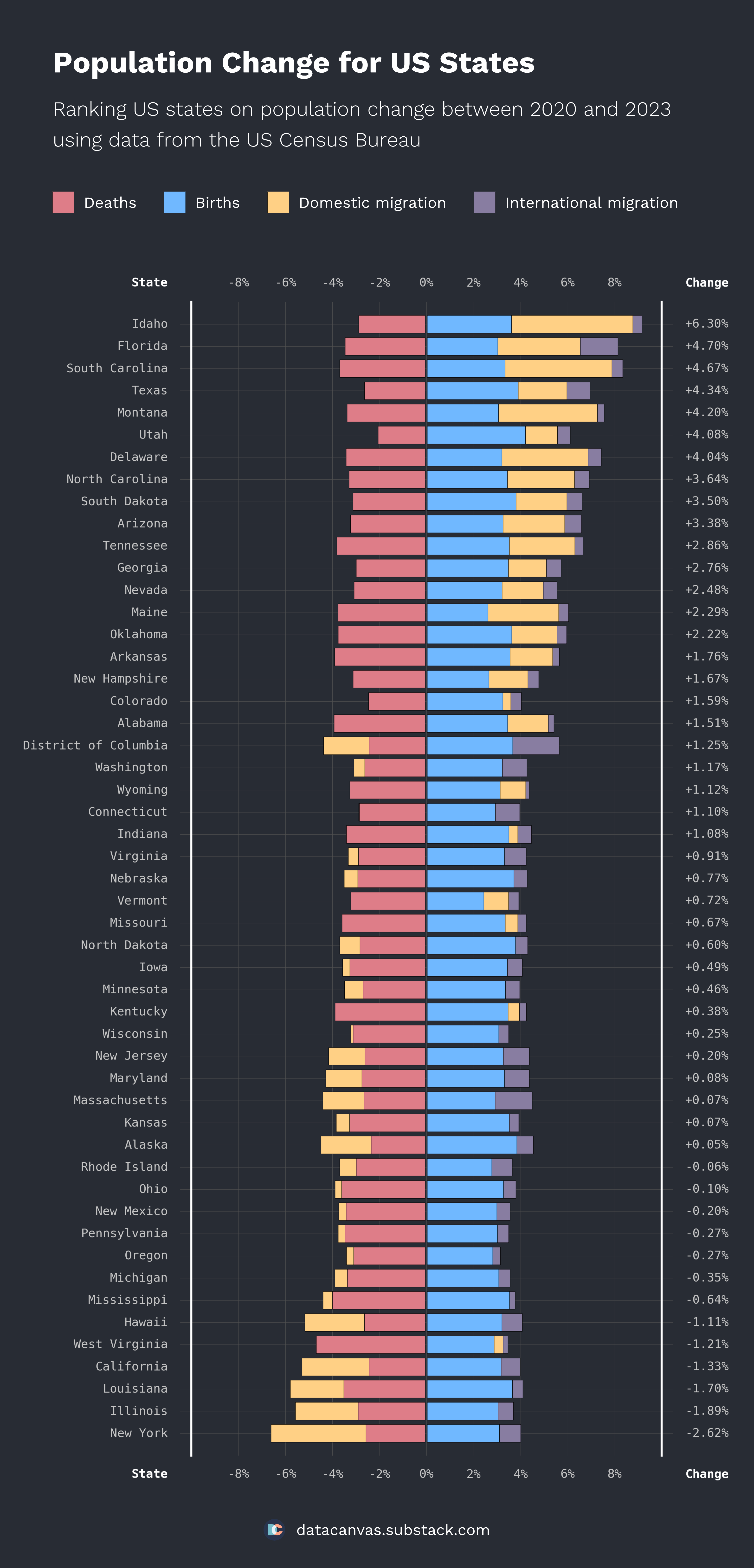
Welcome to a new data visualization. Since many liked yesterday’s visualization of population change for US counties, I’ve created a more detailed chart for US States. Let me know what you think, and don’t forget to share and subscribe. 🇺🇸
The numbers
This time, I’ve created a visualization that shows more detailed information about the underlying numbers, so there’s not much to say.
Domestic migration explains the difference in population change between states more than other factors, but birth-/deathrates also plays a role.
All states have a positive international migration between 0.1% and 2%.
The design
I created a map last time, so I wanted to do something else today. Since it’s interesting to see the details behind population change, I wanted to create a bar chart with positive and negative values on the x-axis.
Also, I wanted to create a clean design with a dark background to switch things up. I enjoy using dark designs, but finding good colors for the data is more challenging. Finding decent colors took me a long time, and I’m still unconvinced about my choices.
I use WorkSans for titles and legends and Monospace for the data. It’s good to use a monospace font when there is a lot of text in the chart because having equal spacing for all characters makes it easier to read.
Request for feedback
Let me know what you think of this design and what you want to see going forward.
Have a fantastic day. 🥂