
Population Change for US Counties
Visualizing the population change between 2020 and 2023 according to Census Bureau

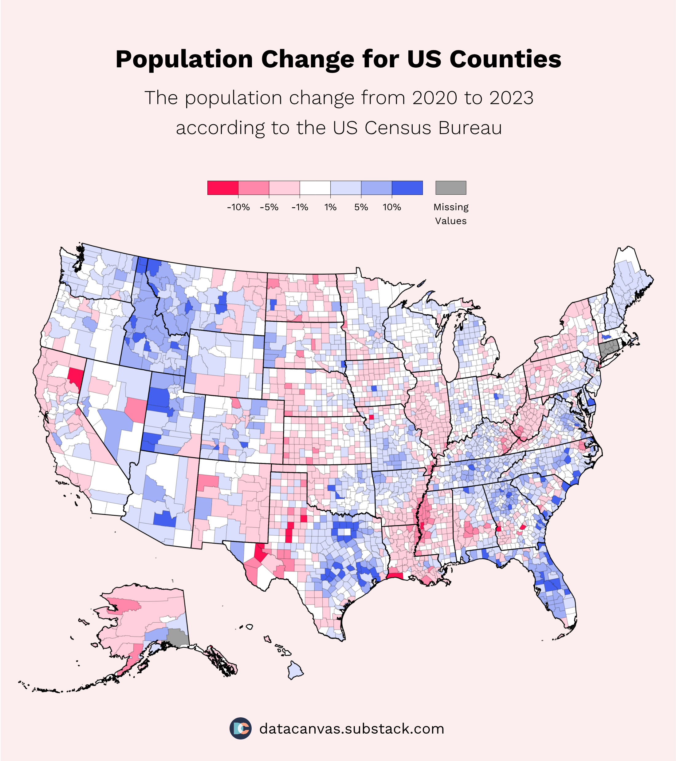
Welcome to a new data visualization. Today, we’re looking at the population change in US counties. Let me know what you think, and don’t forget to share and subscribe. 🇺🇸
The numbers
Growing
2.46% of counties had a population growth of over 10%. These counties are primarily in Idaho, Florida, Texas, Montana, Utah, and South Carolina.
8.10% of counties had a population growth of between 5% and 10%.
29.65% had a population growth of between 1% and 5%
Decreasing
0.41% of counties had a population decrease of 10% or more.
2.67% of counties had a population decrease between 5% and 10%.
27.64% of counties had a population decrease between 1% and 5%.
States
The five top states in terms of growth are Idaho (6.24%), Florida (4.72%), South Carolina (4.70%), Texas (4.34%), and Montana (4.19%).
The five worst states in terms of growth are New York (-2.65%), Illinois (-1.88%), Louisiana (-1.68%), California (-1.36%), and West Virginia (-1.2%).
Do you want more?
I’m going into detail on whether the growth comes from immigration or birth rates, but I can create additional visualization on the topic if you’re interested. Let me know if that’s the case! 😄
The design
Buckets
I decided to divide the population change into buckets instead of an alpha gradient because buckets are more straightforward to visualize. With alpha gradients, it’s difficult to see the actual values, and that’s a bad user experience, even with the increased granularity.
Colors
I wanted to use red and blue because they make sense and relate to the US flag. The red color is #FF1053, and the blue is #4361EE. The other colors are more transparent versions of the same two.
Request for feedback
Let me know what you think of this design and what you want to see going forward.
Have a fantastic day. 🥂